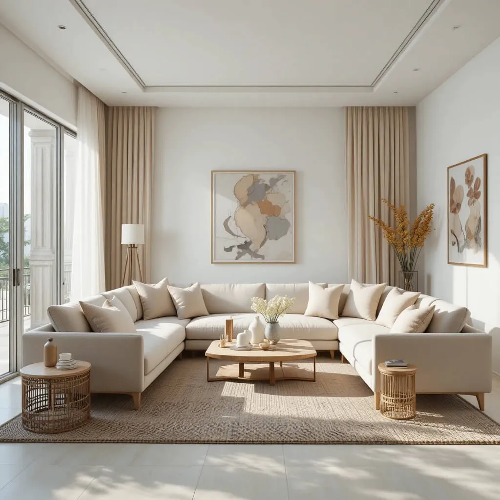
Choosing a Living Room color palette sounds fun until you are staring at seventeen paint swatches wondering why every beige suddenly looks emotionally complicated.
The truth is, the right color combination can completely change how a Living Room feels. Some palettes make a space feel airy and relaxed, while others create drama, warmth, or that expensive designer look people somehow achieve without visibly trying.
And honestly, modern Living Rooms are no longer about playing it painfully safe. The most stylish spaces right now mix warmth, contrast, softness, and personality in a way that feels layered instead of flat.
So if your Living Room feels a little uninspired lately, these chic color combinations might be exactly the refresh it needs.
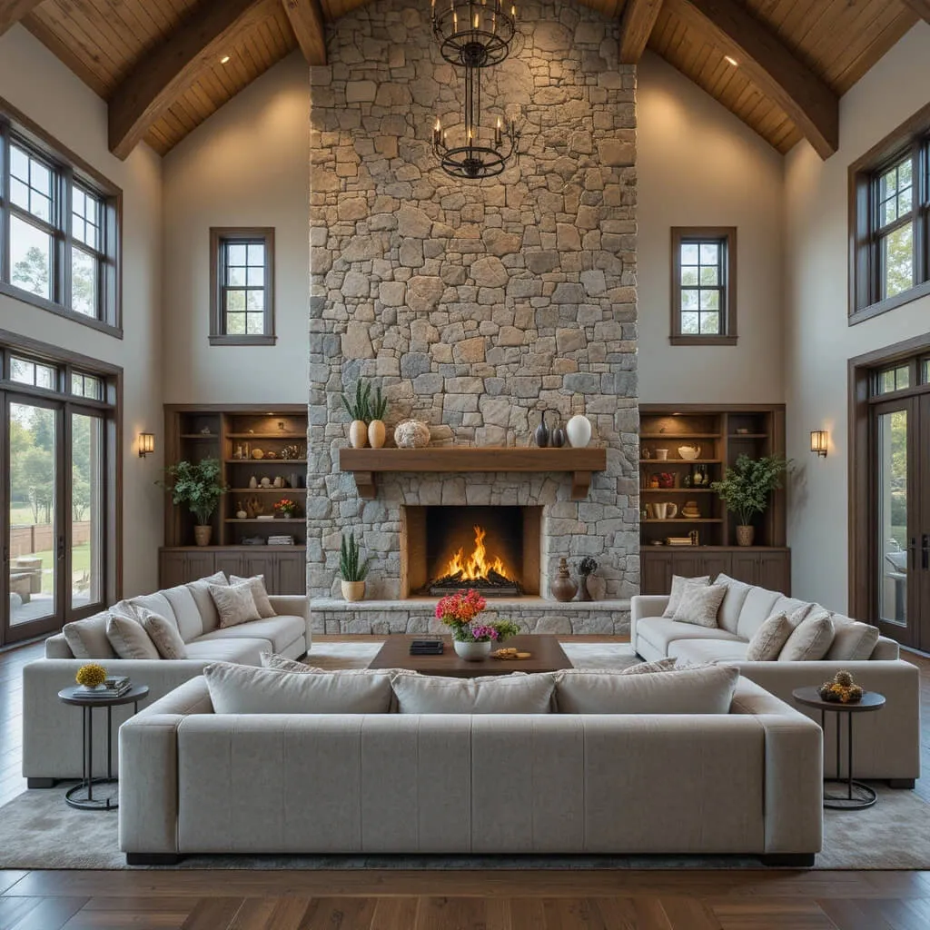
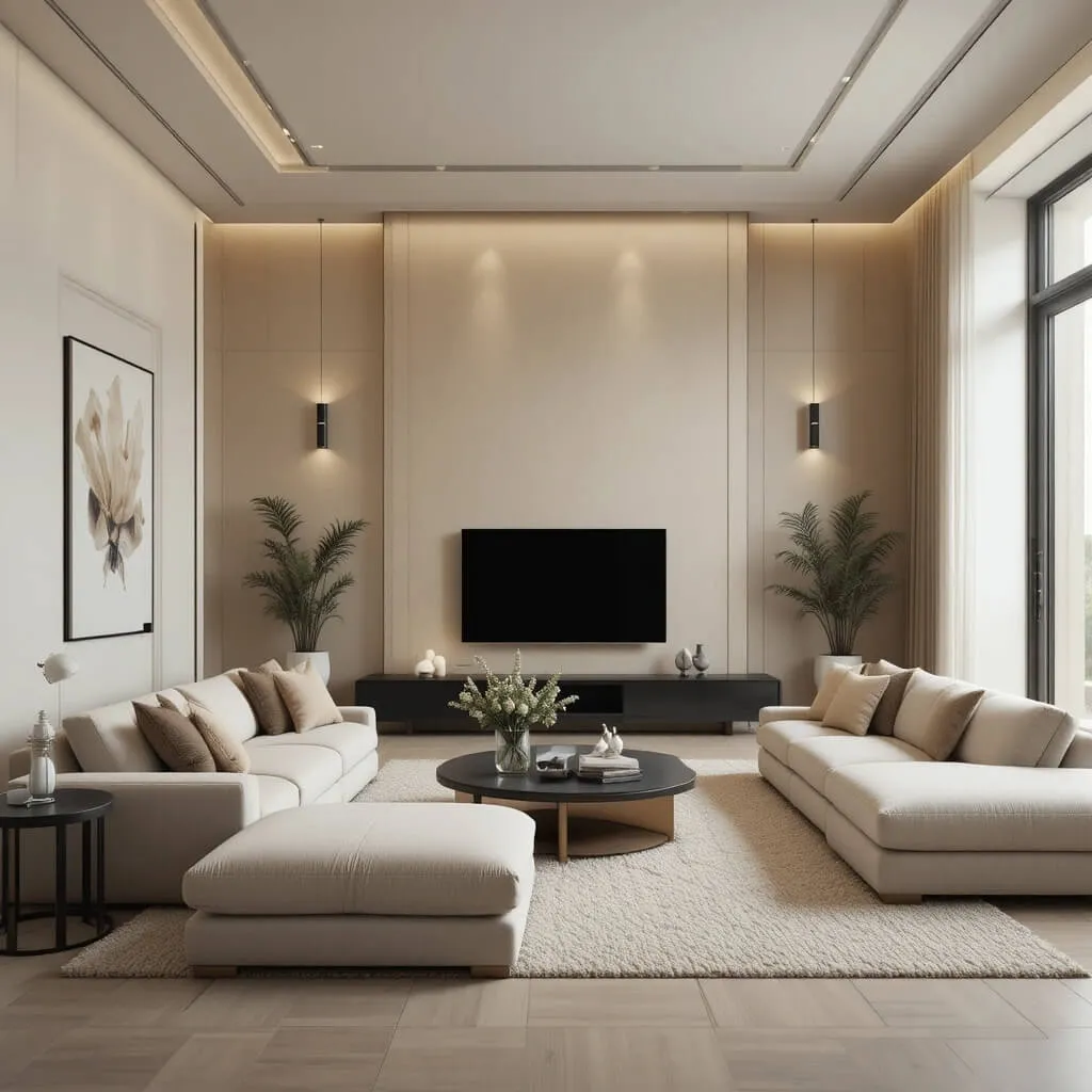
1. Warm White and Soft Beige
This combination is basically the quiet luxury version of a deep exhale.
Warm white walls paired with soft beige furniture create a Living Room that feels airy, calm, and effortlessly polished without trying too hard. It works beautifully in modern spaces because it keeps things minimal while still feeling warm and inviting.
Layering different shades of cream, ivory, oatmeal, and sand prevents the room from looking flat. Add linen curtains, textured throws, and light oak furniture, and suddenly the entire space starts looking like a boutique hotel lobby where somebody definitely serves overpriced cappuccinos in ceramic cups.
Why This Works
The subtle contrast between warm white and beige creates depth without overwhelming the room, making the space feel larger and softer at the same time.
Designer Tip
Use multiple textures throughout the room so the neutral palette feels layered instead of bland.
2. Charcoal Gray and Warm Wood
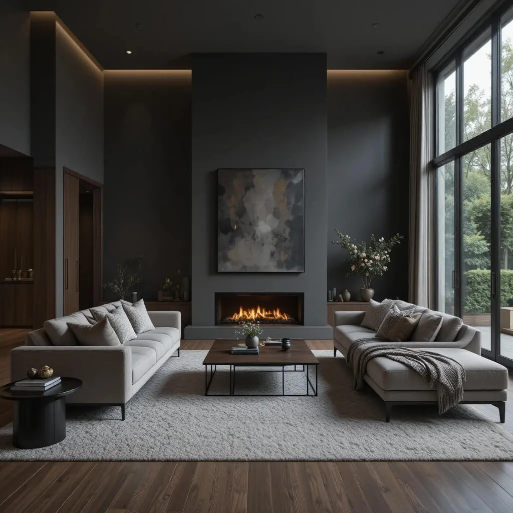
This palette feels modern, grounded, and slightly dramatic in the best possible way.
Charcoal gray walls or furniture instantly add sophistication, while warm wood tones keep the room from feeling cold or overly industrial. The balance between dark and organic elements creates a rich, tailored look that feels incredibly current.
This combination works especially well with black accents, warm lighting, and oversized furniture pieces that make the room feel intentional and cozy instead of stiff.
Cozy Factor
The mix of moody gray and natural wood creates a warm cocoon-like atmosphere that feels perfect for slow evenings and oversized blankets.
Watch Out For
Too much cool gray without warm textures can make the room feel flat and lifeless very quickly.
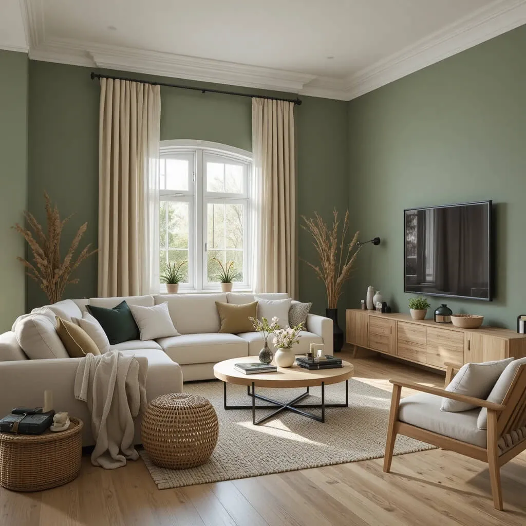
3. Olive Green and Cream
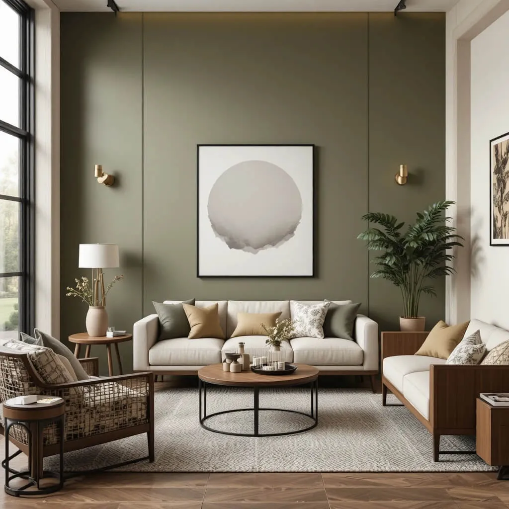
Olive green has quietly become one of the most stylish colors in modern interiors, and honestly, it deserves the attention.
Paired with creamy neutrals, olive green creates a Living Room that feels earthy, relaxed, and elevated without looking trendy in an exhausting way. It brings just enough color into the space while still maintaining a calm, sophisticated atmosphere.
This palette looks especially beautiful with natural wood, black accents, woven textures, and soft lighting.
Luxury Look for Less
Even affordable furniture pieces tend to look more expensive when styled against rich olive tones and creamy neutrals.
Best Pairings
- black metal accents
- walnut furniture
- linen fabrics
- warm brass lighting
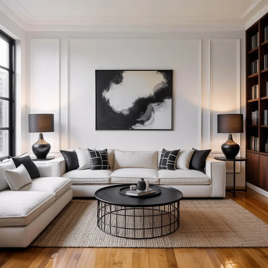
4. Black and Warm Taupe
If you want your Living Room to look expensive immediately, this combination rarely disappoints.
Warm taupe softens the boldness of black, creating a space that feels dramatic without becoming overwhelming. Black adds structure and contrast, while taupe keeps the room feeling calm and livable.
The result feels modern, tailored, and quietly luxurious — like the kind of Living Room that belongs to someone who definitely owns expensive candles.
Why This Works
Black creates definition while taupe adds warmth, giving the room a balanced and layered appearance.
Personal Take
All-gray Living Rooms are slowly starting to feel emotionally unavailable. Taupe brings warmth back into modern spaces without sacrificing sophistication.
5. Dusty Blue and Soft White
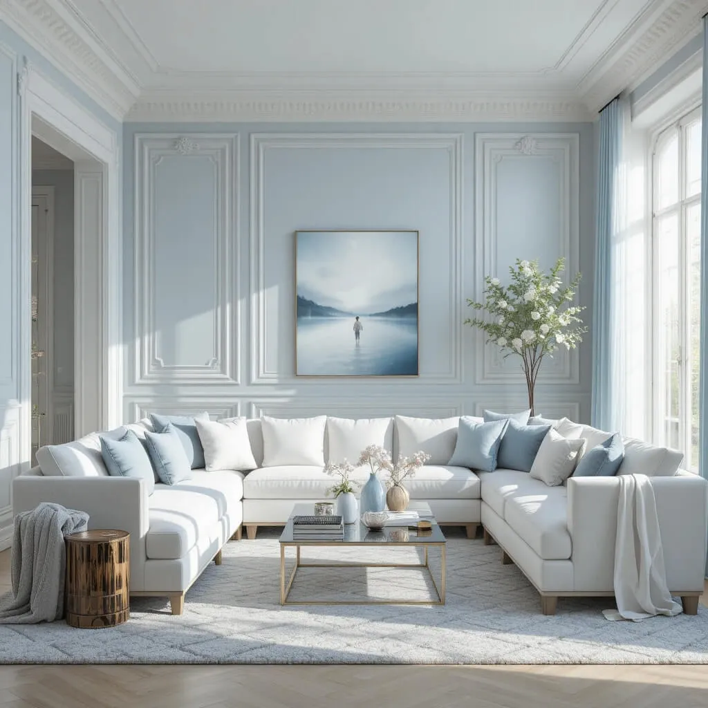
This palette feels calm, airy, and effortlessly elegant.
Dusty blue adds a soft hint of color without overpowering the room, while crisp white keeps everything fresh and light. Together, they create a Living Room that feels peaceful but still polished enough to look intentionally designed.
This color combination works beautifully in spaces with lots of natural light, especially when paired with soft textures and subtle metallic accents.
Designer Tip
Use muted blue tones instead of bright blue shades to keep the room feeling modern and sophisticated.
Cozy Factor
The soft contrast creates a breezy atmosphere that feels both relaxing and refined.
6. Terracotta and Cream
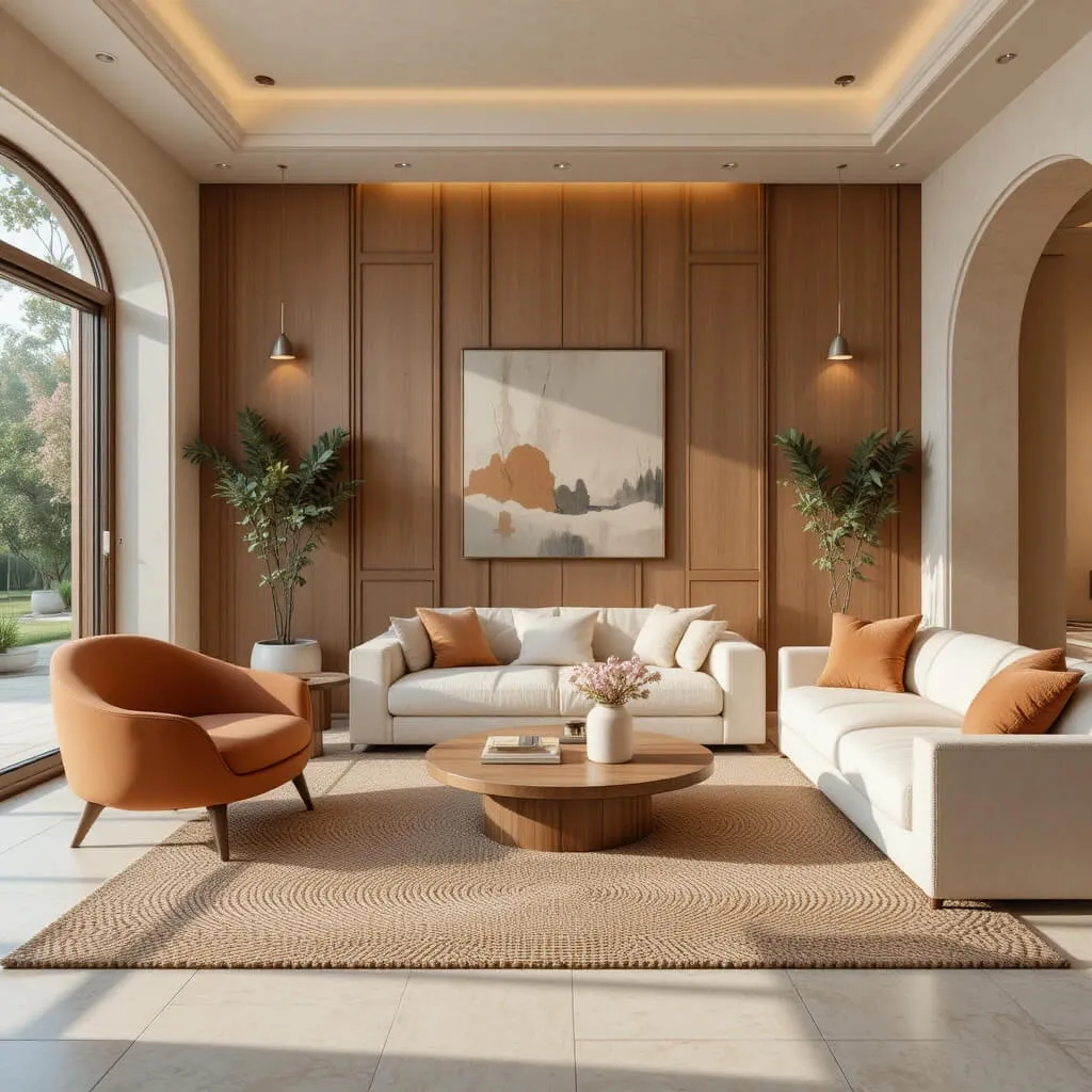
Terracotta instantly makes a Living Room feel warmer and more inviting.
When paired with creamy whites and soft neutral tones, terracotta creates a modern organic look that feels rich, earthy, and full of personality. It brings warmth into the room without making the palette feel too dark or heavy.
This combination works especially well with curved furniture, natural wood, textured rugs, and soft ambient lighting.
Why This Works
Terracotta adds warmth and depth while cream tones keep the palette balanced and airy.
Watch Out For
Too many orange-heavy shades can make the room feel overly rustic instead of modern.
7. Sage Green and Light Oak
There is something incredibly calming about this combination.
Sage green paired with light oak creates a Living Room that feels fresh, organic, and effortlessly modern. The soft green tones bring subtle color into the space while the oak keeps everything warm and natural.
This palette is perfect if you want your Living Room to feel cozy without leaning too dark or dramatic.
Best Pairings
- ivory upholstery
- woven baskets
- linen curtains
- matte black accents
Luxury Look for Less
Sage green walls can make even simple furniture pieces look intentionally curated.
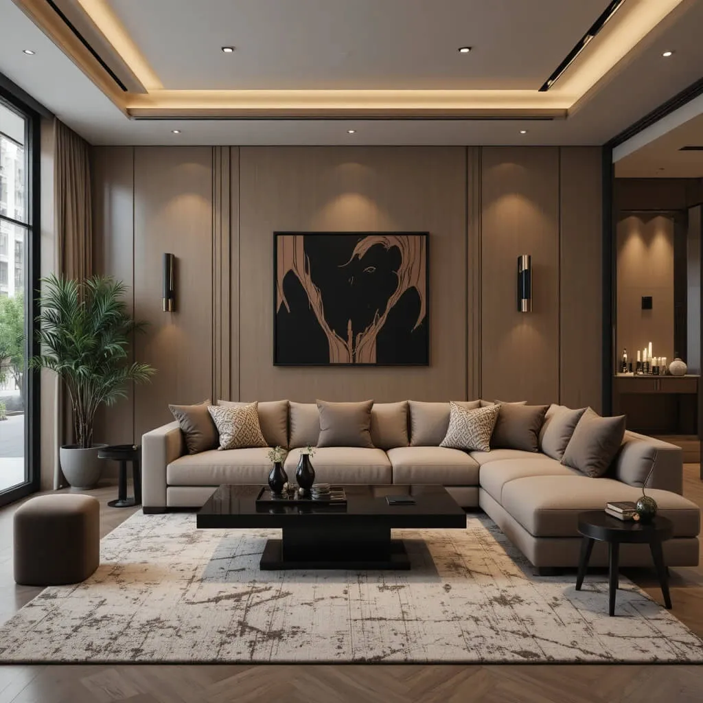
8. Chocolate Brown and Cream
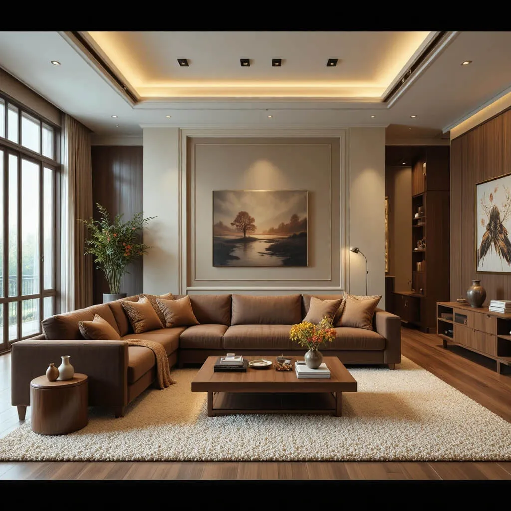
Brown is officially having a major comeback, and honestly, modern Living Rooms look far more interesting because of it.
Chocolate brown paired with creamy neutrals creates a rich, cozy atmosphere that feels sophisticated instead of outdated. The key is balancing deep brown tones with lighter fabrics and warm lighting so the room still feels open.
This palette works beautifully in spaces that lean modern, contemporary, or organic minimalist.
Why This Works
The contrast between dark brown and soft cream creates warmth, depth, and visual richness.
Designer Tip
Layer multiple shades of brown throughout the room for a more elevated and designer-inspired look.
9. Navy Blue and Warm White
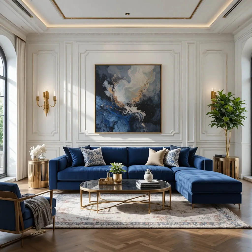
Navy blue adds instant depth and elegance to a Living Room.
When paired with warm white walls or furniture, the contrast feels crisp, timeless, and incredibly polished. Navy works beautifully as an accent color through sofas, built-ins, rugs, or statement walls.
The palette feels bold without becoming overwhelming, which is why designers keep returning to it year after year.
Personal Take
Navy blue somehow manages to feel classic and dramatic at the same time, which honestly feels unfair to every other color.
Watch Out For
Too much navy without lighter elements can make smaller Living Rooms feel visually heavy.
10. Greige and Subtle Black Accents
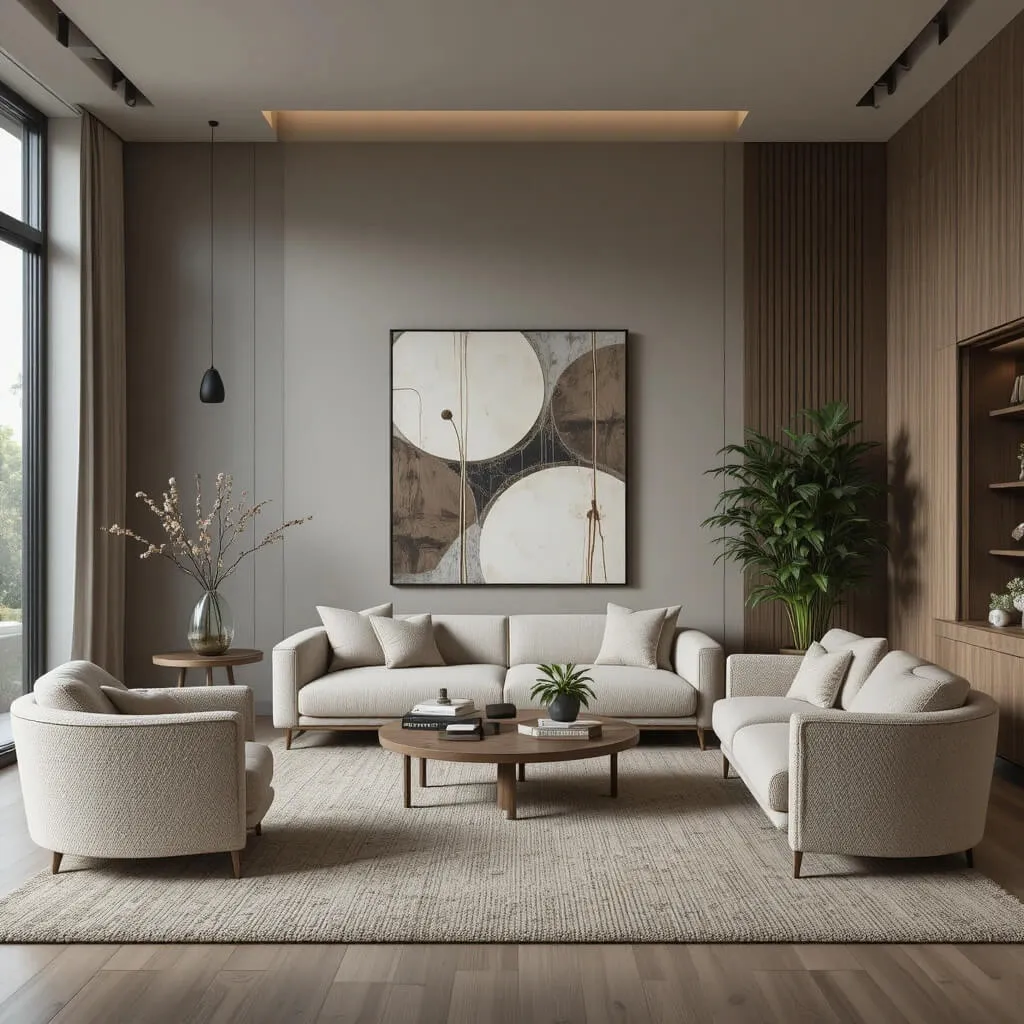
Greige (that perfect mix between gray and beige), continues to dominate modern interiors for good reason.
Paired with black accents, greige creates a Living Room that feels soft, contemporary, and incredibly refined. It gives you the modern feel of gray without the coldness that made some older gray interiors feel like upscale office waiting rooms.
Black lighting, frames, or furniture help sharpen the palette and add contrast.
Why This Works
Greige softens modern spaces while black accents create structure and sophistication.
Best Pairings
- boucle furniture
- warm oak finishes
- textured rugs
- oversized artwork
11. Blush Pink and Warm Beige
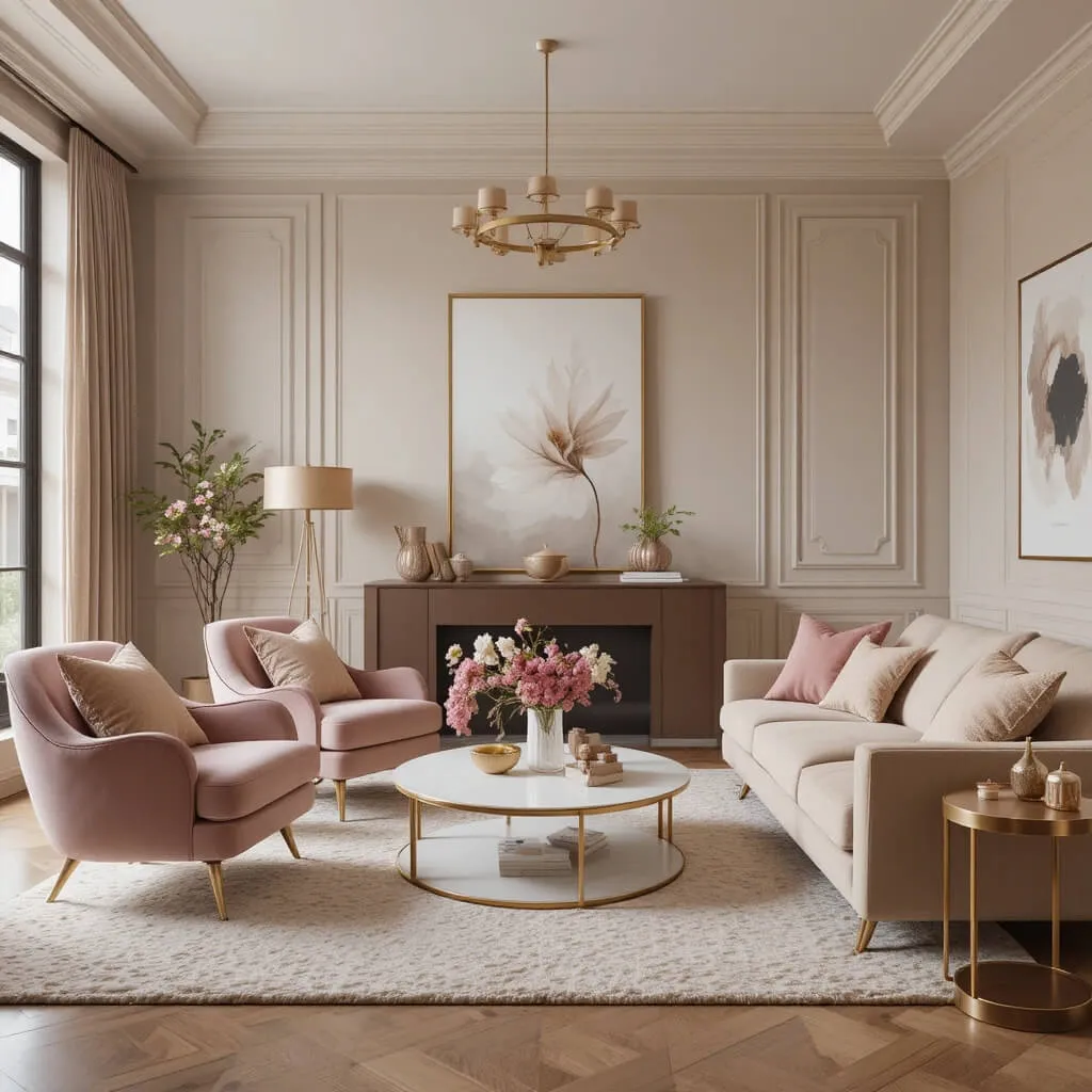
This combination feels surprisingly sophisticated when done correctly.
Soft blush tones layered with warm beige create a Living Room that feels elegant, cozy, and subtly luxurious instead of overly feminine. The muted warmth of both colors keeps the palette feeling modern and relaxed.
Blush works especially well through accent chairs, pillows, artwork, or rugs paired with neutral furniture and warm metallic accents.
Cozy Factor
The soft warm tones create a welcoming atmosphere that feels calm, stylish, and incredibly comfortable.
Designer Tip
Stick with muted blush shades instead of bright pink tones for a more elevated look.
12. Forest Green and Black
This palette feels bold, dramatic, and incredibly chic.
Forest green walls or furniture paired with black accents create a moody modern aesthetic that feels rich and layered. The dark green adds depth while black sharpens the overall look and keeps the space feeling contemporary.
Add warm lighting and soft textures to balance the darker tones and prevent the room from feeling too heavy.
Why This Works
Deep green adds color and warmth while black creates contrast and structure.
Watch Out For
Without enough lighting, dark green and black together can make the room feel smaller than intended.
13. Soft Gray and Camel
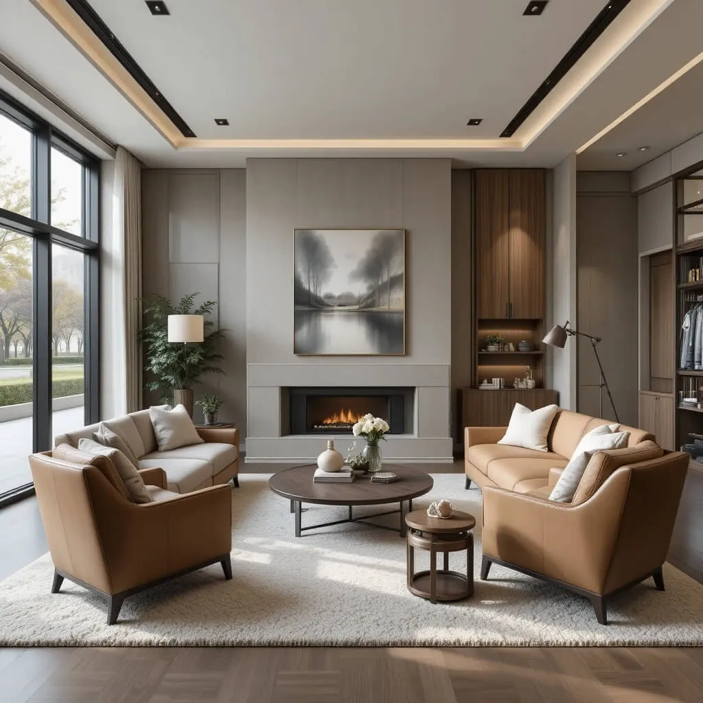
Camel tones instantly warm up gray interiors.
This combination creates a Living Room that feels tailored, cozy, and modern without looking overly trendy. Soft gray provides a calm backdrop while camel leather, wood tones, or textiles add richness and warmth.
It is one of those palettes that quietly makes a room look more expensive.
Luxury Look for Less
Camel accent chairs or pillows can dramatically elevate a basic gray Living Room without requiring a full redesign.
14. Beige and Matte Black
Minimalist but still warm — that is the beauty of this combination.
Beige walls and furniture create softness while matte black accents bring contrast and definition into the space. The overall look feels clean, modern, and effortlessly stylish without becoming cold or sterile.
This palette works beautifully in contemporary spaces with simple lines and layered textures.
Personal Take
Matte black accents are basically the interior design version of good tailoring. They make almost everything look more intentional.
Designer Tip
Use soft fabrics and natural textures to keep the contrast from feeling too sharp.
15. Rust Orange and Deep Brown
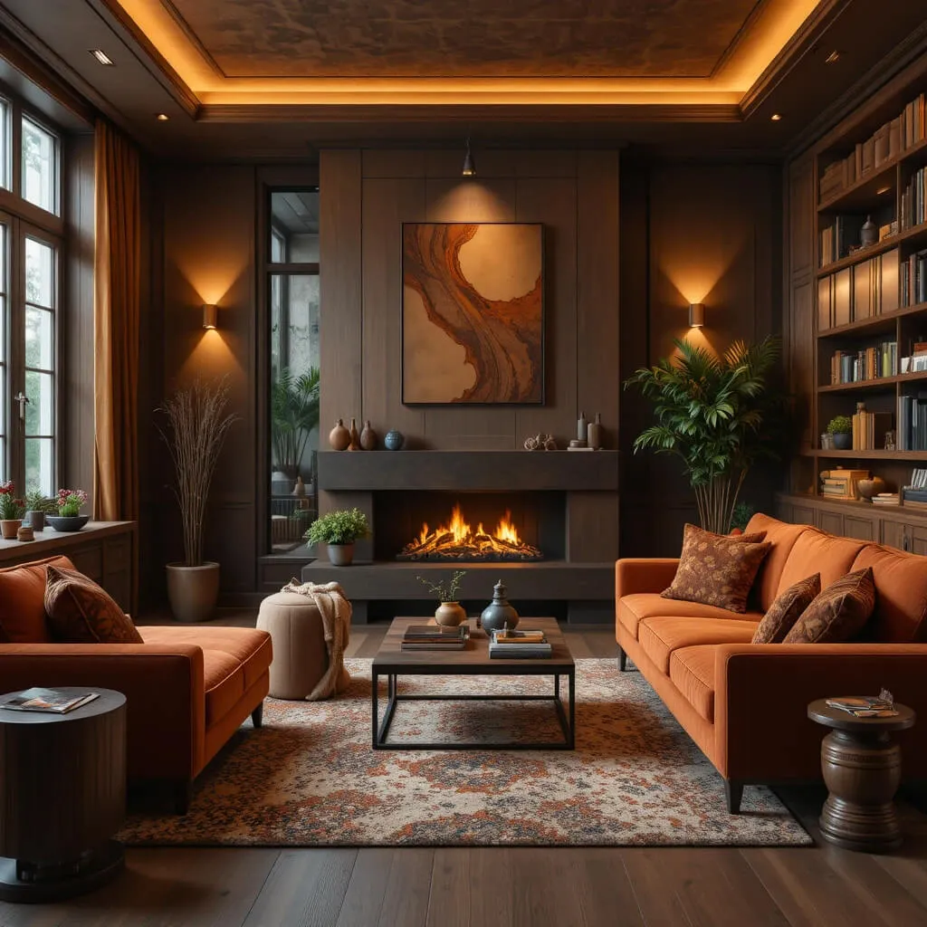
If you want a Living Room that feels cozy, bold, and full of personality, this combination delivers.
Rust orange adds warmth and energy while deep brown grounds the space and creates richness. Together, they create a palette that feels earthy, inviting, and surprisingly modern when balanced with lighter neutrals.
This look pairs beautifully with vintage-inspired decor, textured fabrics, and warm ambient lighting.
Why This Works
Both colors share warm undertones, creating a layered palette that feels cohesive and comforting.
Cozy Factor
The rich earthy tones make the room feel warm, relaxed, and perfect for evenings when you fully intend to watch one episode and somehow finish an entire season instead.
16. Cream and Soft Lavender
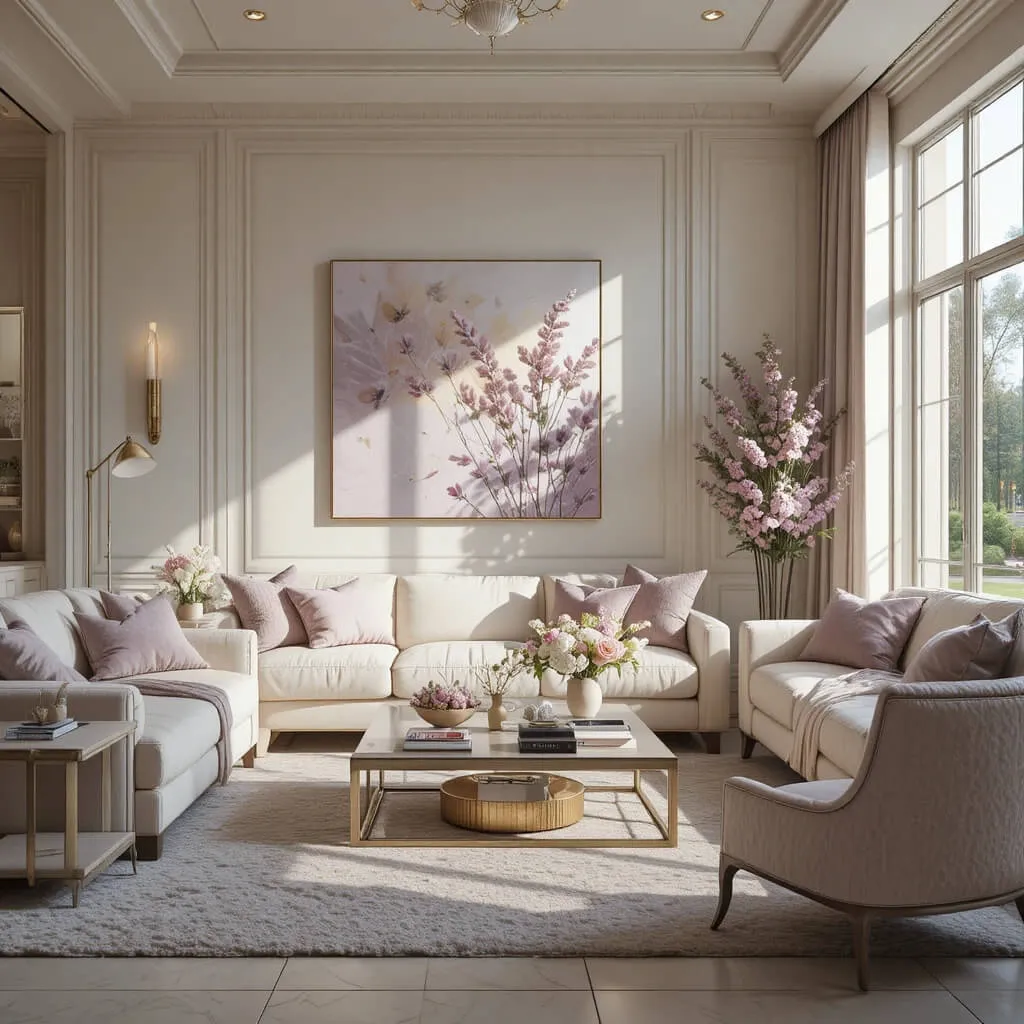
Soft lavender might sound risky for a modern Living Room, but when paired with creamy neutrals, it feels elegant, calming, and surprisingly sophisticated.
The key is using muted lavender tones instead of anything overly pastel or sugary. Think soft dusty lavender pillows, accent chairs, or artwork layered into a warm cream Living Room with textured fabrics and subtle metallic accents.
This combination creates a space that feels fresh and slightly unexpected without screaming for attention.
Designer Tip
Keep lavender as a supporting color rather than the dominant shade to maintain a chic, modern feel.
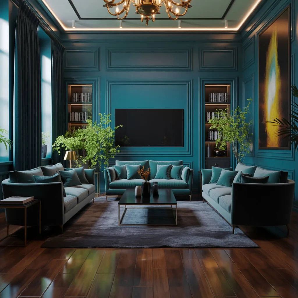
17. Deep Teal and Warm Beige
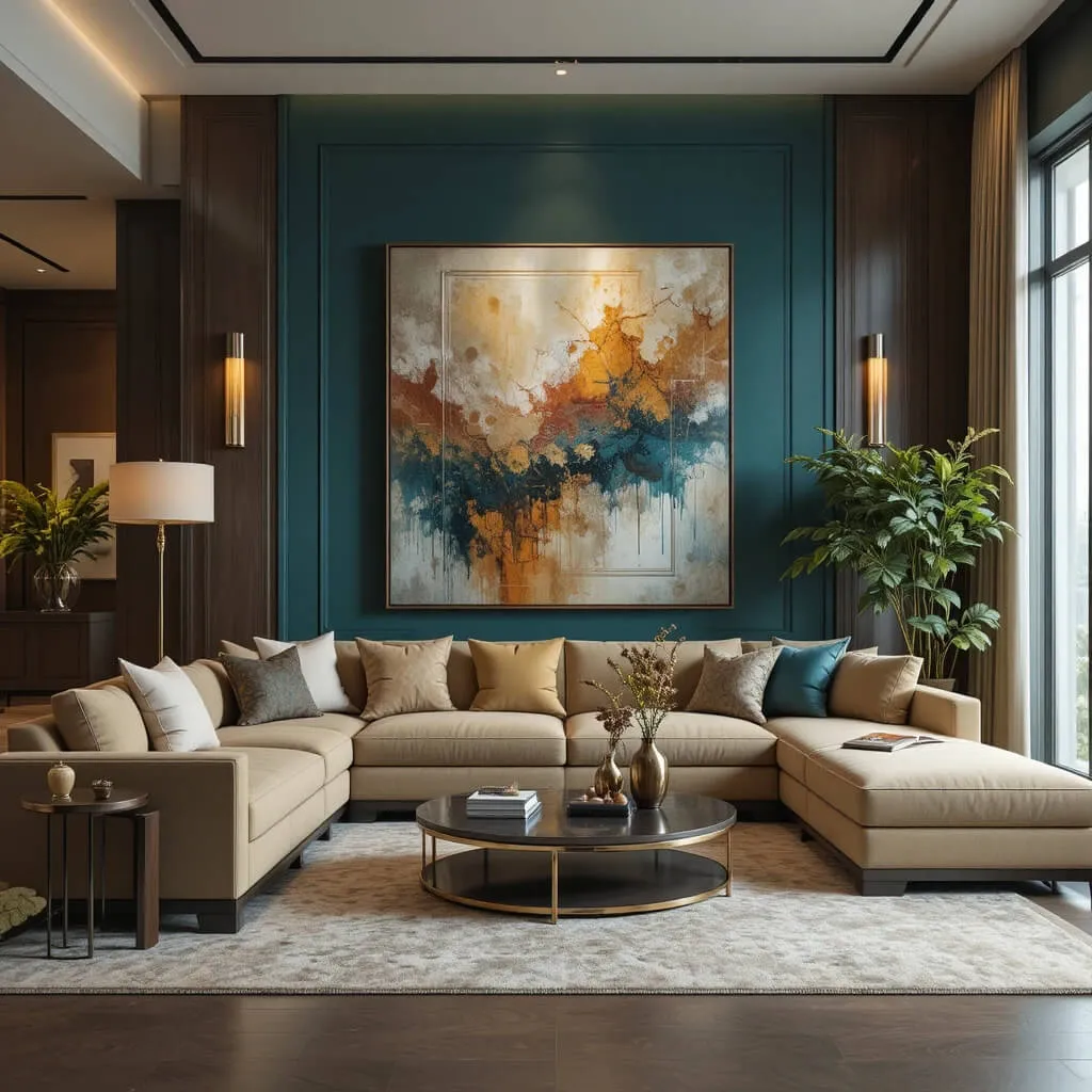
Deep teal instantly adds richness and personality to a Living Room.
When balanced with warm beige tones, the result feels dramatic yet approachable — like a modern designer space that still feels comfortable enough to actually live in. Teal works beautifully through sofas, accent walls, curtains, or oversized artwork paired with soft neutral furniture.
The contrast between the bold jewel tone and warm beige creates a layered, luxurious atmosphere without feeling overly formal.
Why This Works
Deep teal adds depth and sophistication while beige softens the palette and keeps the room feeling warm and balanced.
Luxury Look for Less
Even simple beige furniture can look far more upscale when styled against deep teal accents or walls.
18. Soft Black and Caramel
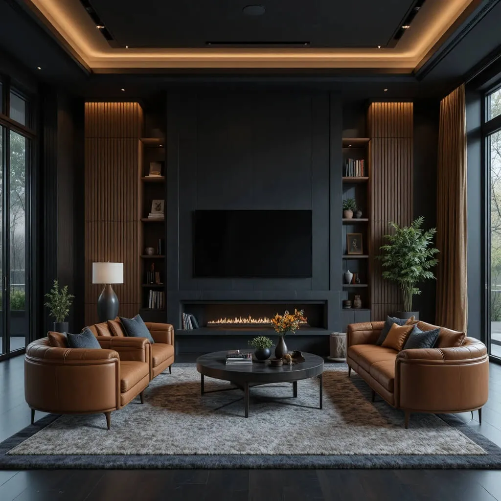
This combination feels moody, rich, and incredibly stylish right now.
Soft black tones paired with warm caramel shades create a Living Room that feels modern, grounded, and full of depth. The caramel warmth prevents black from feeling too harsh, while black sharpens the palette and gives the room that polished designer look.
Think black accent walls, caramel leather chairs, warm wood finishes, and layered lighting that makes the entire space glow at night.
Personal Take
Caramel leather and black accents together somehow make a Living Room look like it belongs in an expensive architecture magazine almost immediately.
Watch Out For
Too much black without enough warm lighting or texture can make the space feel heavy instead of cozy.
Wrapping Up
The right Living Room color combination can completely transform how your space feels. Some palettes create softness and calm, while others bring drama, contrast, or warmth that instantly makes the room feel more elevated.
The secret is choosing colors that not only look beautiful together but also create the atmosphere you actually want to live in every day.
Whether you love warm neutrals, moody greens, dramatic black accents, or earthy modern tones, the best Living Rooms feel layered, intentional, and comfortable enough to truly enjoy.
Sometimes all it takes is the right color palette to make the entire space finally feel finished.