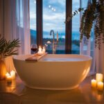
Staring at the same old bathroom tiles or that beige paint you chose in a panic five years ago? Yeah, it’s not exactly sparking joy anymore.
You crave that spa-like calm, that “ahhh” moment when you step in, maybe even before the coffee kicks in. But picking a color? It feels like choosing a tattoo – permanent and terrifying!
Relax, friend. I’ve been down this rabbit hole (and painted a few walls… and ceilings… oops). Forget boring beige. We’re diving into 14 seriously fresh bathroom color ideas guaranteed to unlock that serenity you’re craving, without needing a Xanax.
Ready to be blown away?
1. Moody Midnight Blue
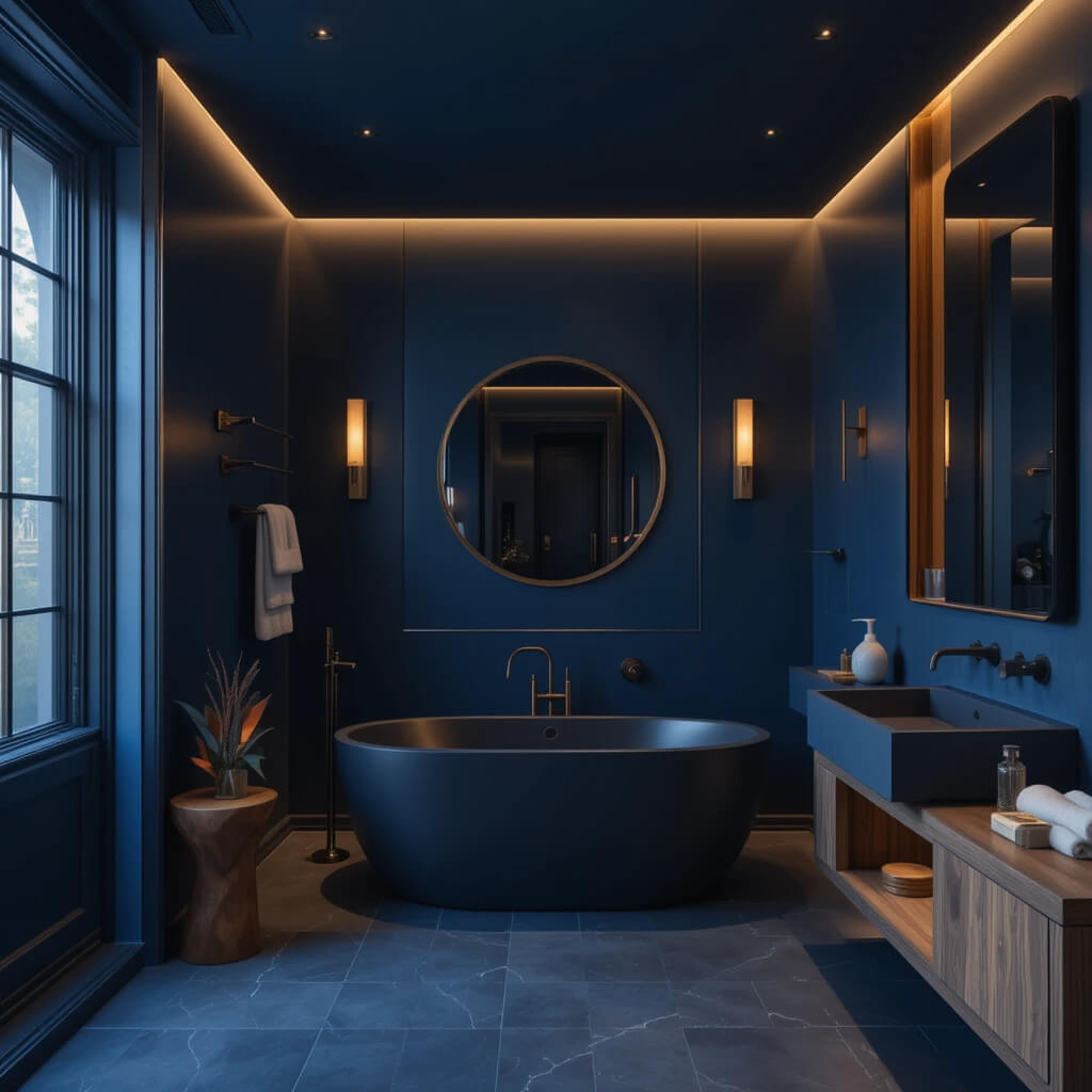
Forget navy, think deep, luxurious midnight. It’s like wrapping your bathroom in velvet. Pair it with matte black fixtures and warm wood tones – instant drama meets cozy.
This color makes even a tiny powder room feel like a high-end boutique hotel. Seriously moody magic.
- Pro Move: Don’t shy away from painting the ceiling too! It creates an enveloping, cocoon-like effect that’s surprisingly soothing. Just ensure you have killer lighting.
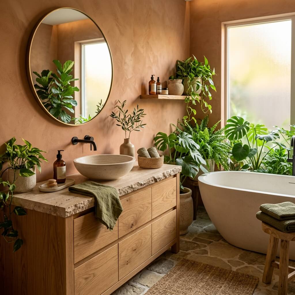
2. Earthy Terracotta Revival
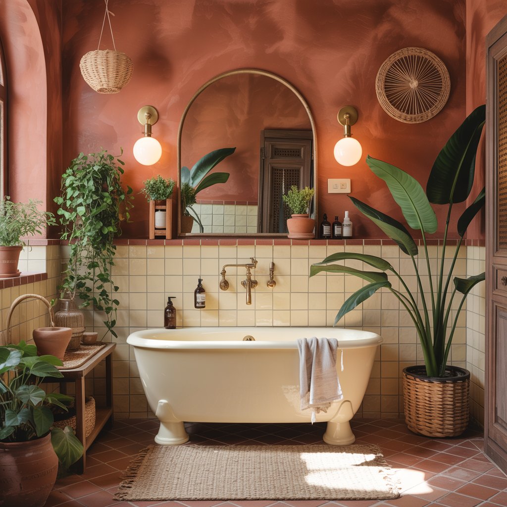
Move over, millennial pink; terracotta is bringing the warm, grounded vibes. It’s the color of sun-baked clay pots and Tuscan villas.
Perfect for adding warmth to a space that can sometimes feel sterile. It instantly makes a bathroom feel lived-in and welcoming.
3. Serene Sage Green
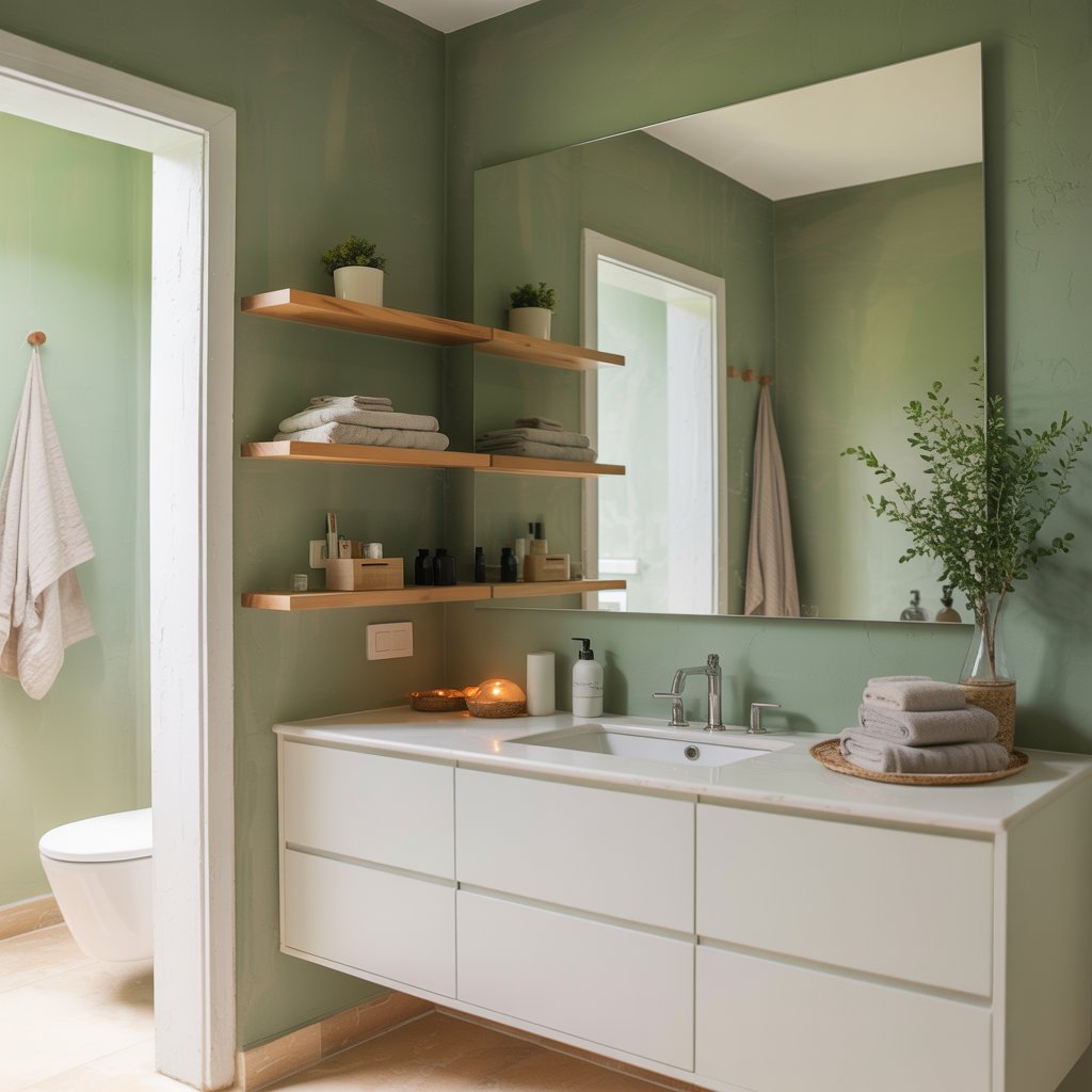
The ultimate chill pill for your walls. Sage green is soft, natural, and universally flattering. It whispers “serenity” without screaming “I’m trying too hard!” It’s basically a neutral that actually has personality.
- Downside? Picking the right sage is key. Some lean too grey, others too yellow. Grab samples and watch them at different times of day. Trust me on this one.
4. Cloud White (But Make It Interesting)
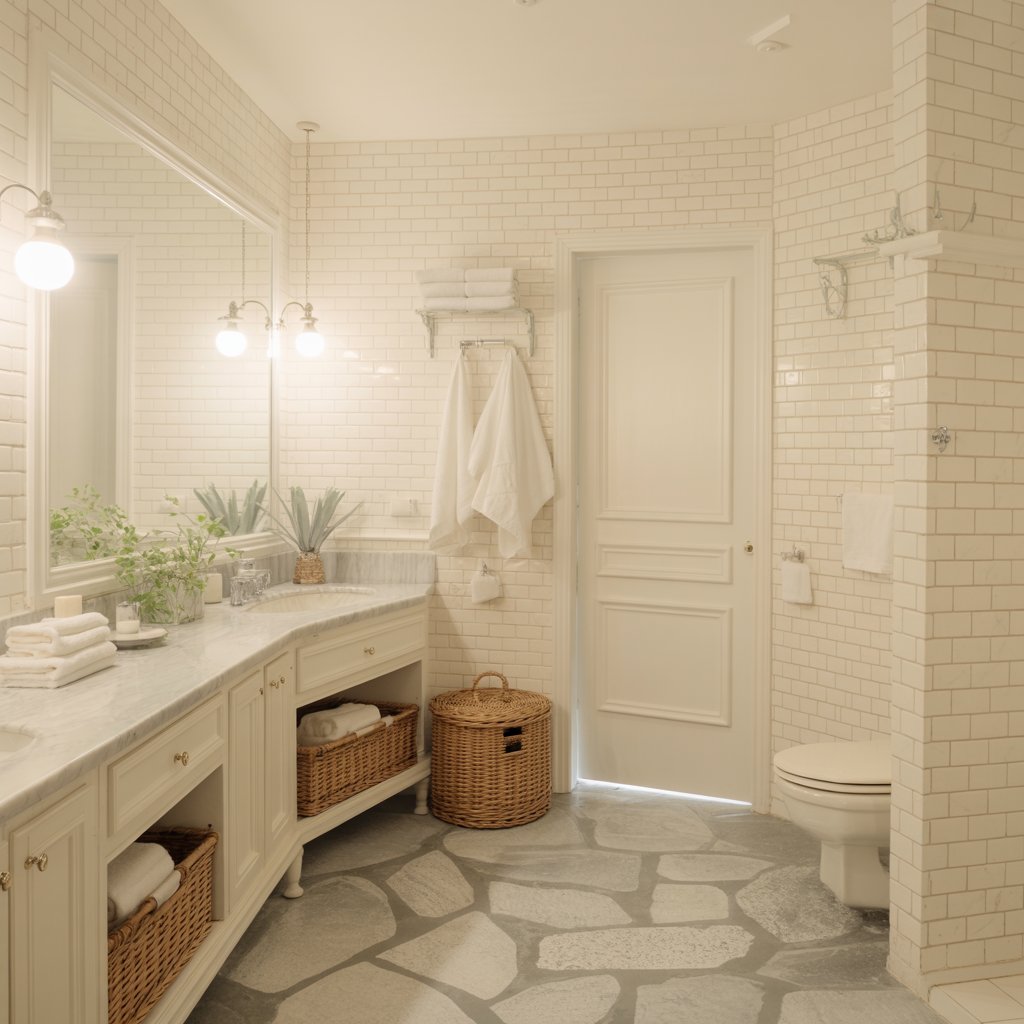
Okay, hear me out. White doesn’t have to be boring! Think warm, creamy whites with subtle undertones (avoid anything too clinical or blue-toned).
Layer textures like fluffy towels, woven baskets, and natural stone. It’s clean, bright, and endlessly sophisticated.
- Pro Tip: Add depth with different shades of white – maybe a slightly deeper tone on the vanity? It prevents the “operating room” vibe. Who wants that first thing in the morning?
5. Bold Charcoal Statement
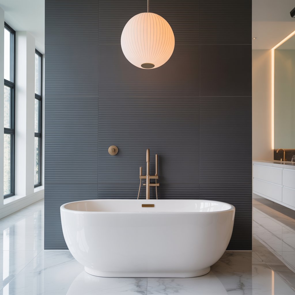
Feeling brave? Charcoal grey is your sophisticated, edgy best friend. It’s sleek, modern, and makes metallics like brushed brass or polished nickel pop.
Perfect for creating a focal wall behind a freestanding tub or vanity.
- Story Time: My friend did her whole small bathroom in a deep charcoal. I thought she was nuts. Saw it finished? Jaw. On. Floor. Paired with white fixtures and lots of light, it was stunningly chic. Go big or go home, right?
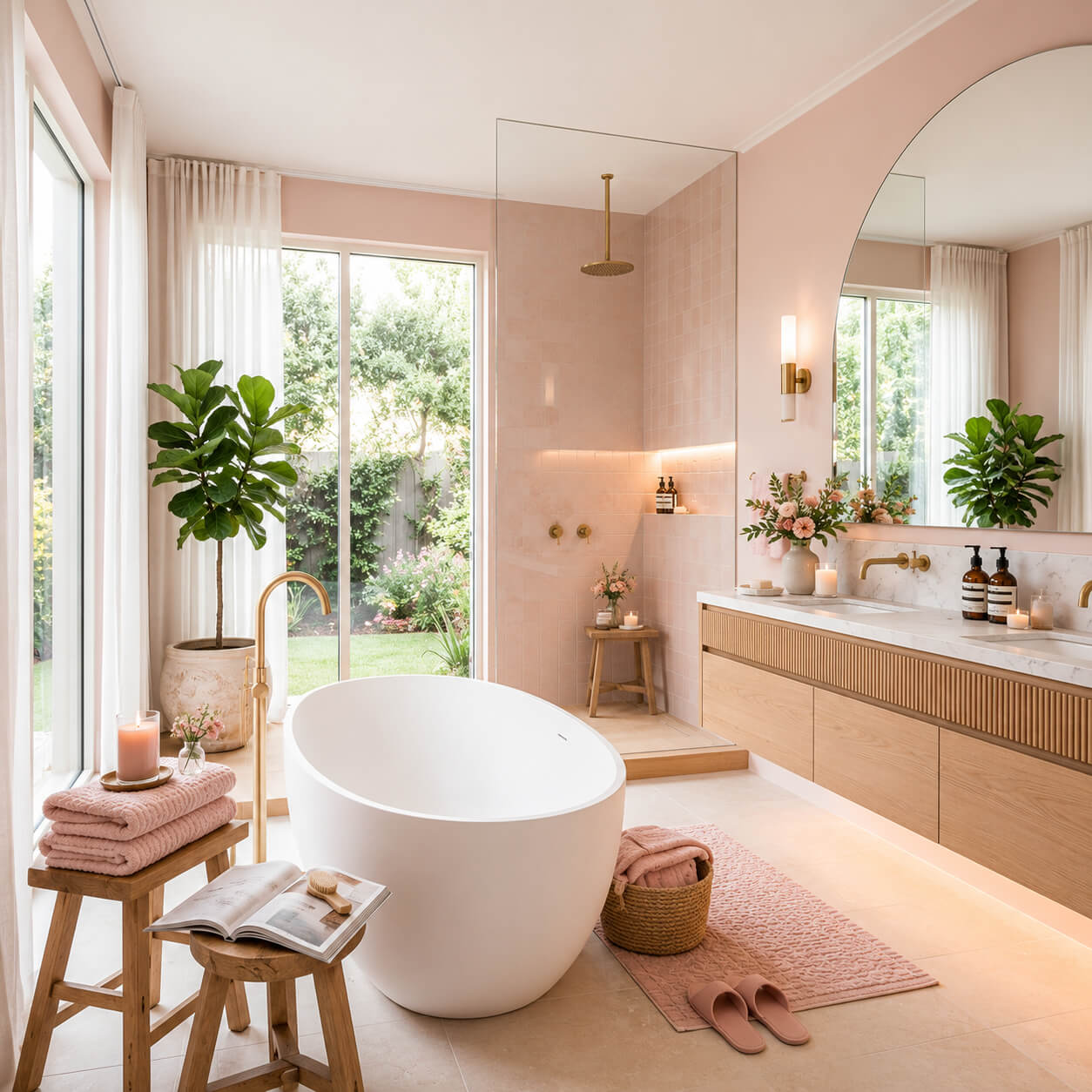
6. Softest Blush Pink
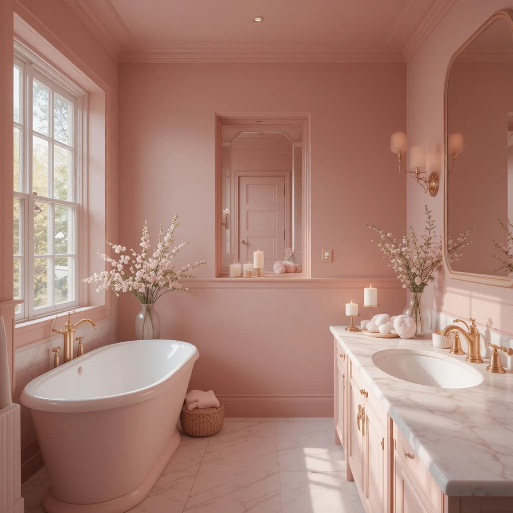
Not your grandma’s bubblegum pink! Think barely-there, dusty rose or clay-inspired blush. It’s soft, romantic, and incredibly calming. Adds warmth without being overly sweet. Perfect for pairing with marble and aged brass.
- Personal Fave: This is my go-to for creating instant “spa” feels in a windowless bathroom. It reflects light beautifully and feels so darn peaceful. IMO, it’s underrated!
7. Refreshing Seafoam Green
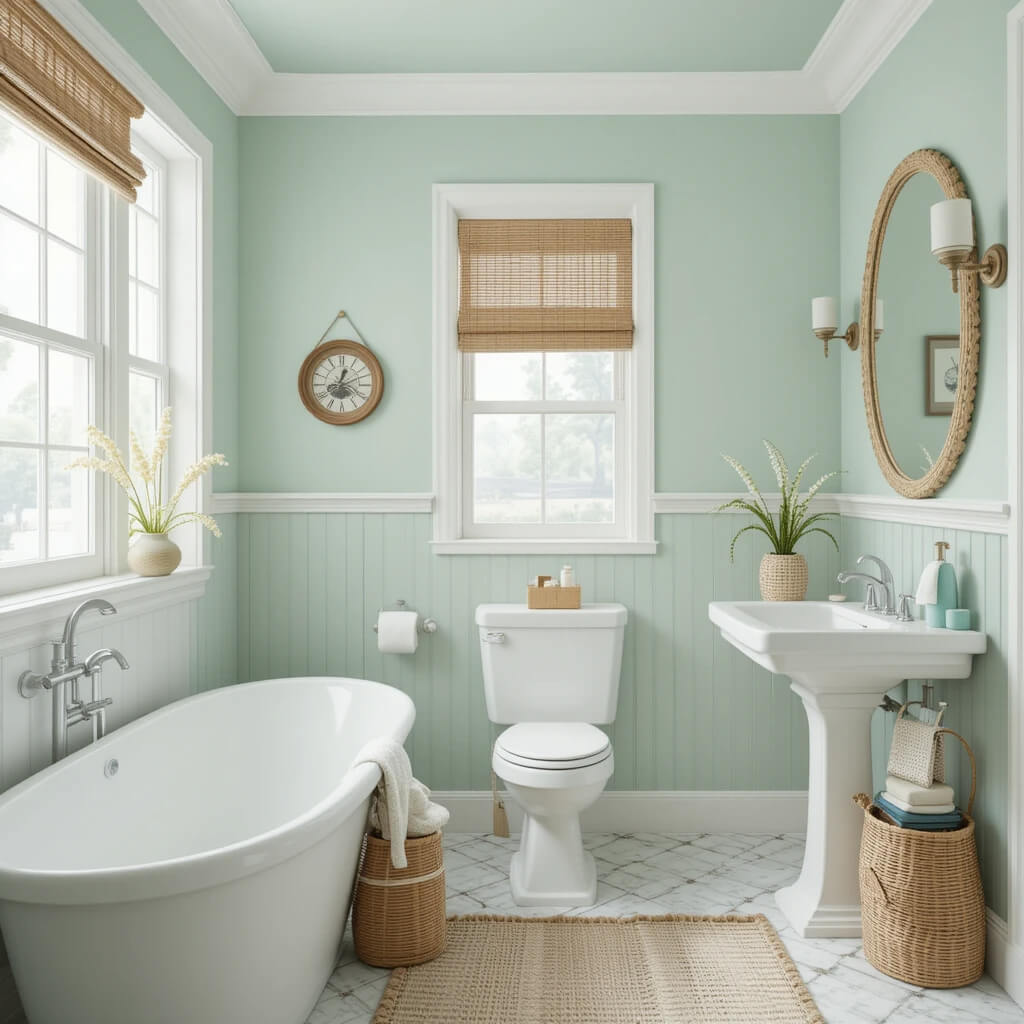
Channel coastal calm without the kitsch. Seafoam is that perfect balance of green and blue – light, airy, and refreshing. It instantly brightens a space and feels clean and revitalizing. Like a breath of fresh ocean air.
- Pro Move: Pair it with crisp white trim and natural rattan accents. Avoid anything too nautical (save the anchors for the boat). Keep it breezy and simple.
8. Rich Olive Grove
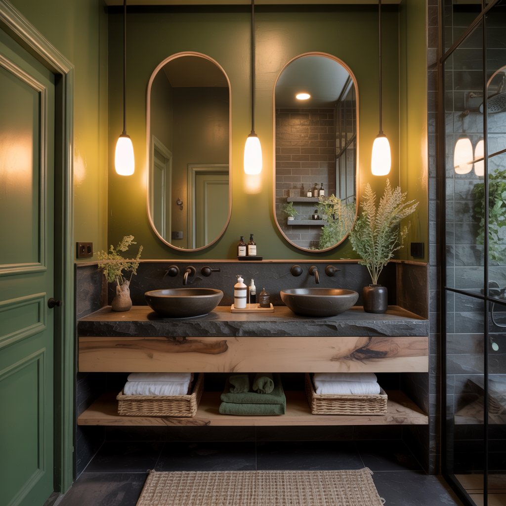
Deeper than sage, richer than khaki – olive green is sophisticated and earthy. It feels grounded and luxurious at the same time.
Amazing for creating a moody, nature-inspired sanctuary. Works beautifully with wood, stone, and black accents.
- Downside? It can feel a bit dark in a windowless space. Counteract it with lots of warm, layered lighting and reflective surfaces. Mirrors are your friend!
9. Sunny Butter Yellow
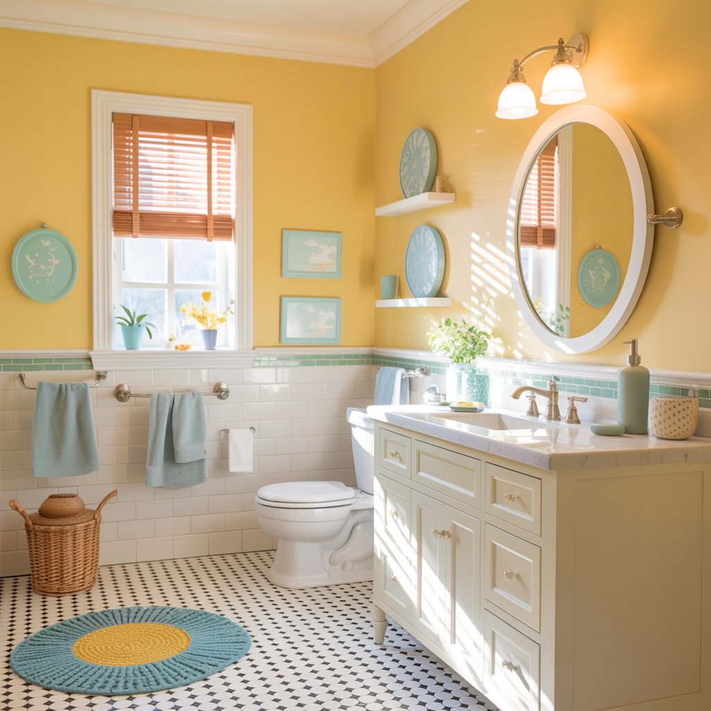
Need a dose of pure, unadulterated cheer? A soft, buttery yellow is sunshine in a can. It instantly lifts the mood and makes even the gloomiest bathroom feel brighter.
Avoid anything too neon or acidic – think warm and mellow.
- Personal Take: Perfect for a kids’ bath or a powder room where you want a burst of happy energy. Paired with white and maybe a touch of light blue? Chef’s kiss.
10. Tranquil Pale Lavender
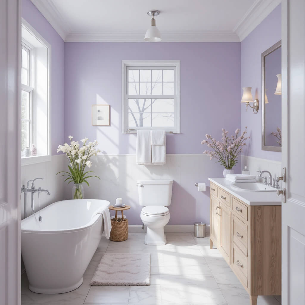
Looking beyond the obvious spa colors? Pale lavender is surprisingly serene. It’s soft, calming, and adds a touch of gentle sophistication.
Avoid anything too purple or intense; aim for a whisper of color. Think barely-there lilac.
- Pro Tip: Keep everything else light and airy – white fixtures, light wood tones, simple linens. Let the lavender be the soft, soothing star. Too much clutter kills the vibe.
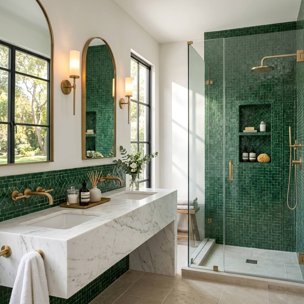
11. Deep Emerald Envy
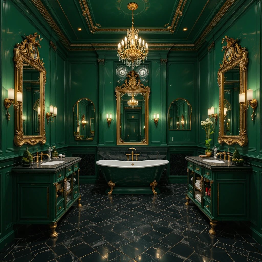
Go full glam with rich, jewel-toned emerald. It’s bold, luxurious, and oozes drama. Incredible in a bathroom with high ceilings or good natural light.
Pair it with gold or brass for pure opulence. Want to feel like royalty brushing your teeth? This is it.
- Story Time: Used this in a client’s master bath with black hexagonal floor tiles and a huge gold mirror. The result? Pure. Bathroom. Goals. It’s a commitment, but oh so worth it.
12. Warm Greige Harmony
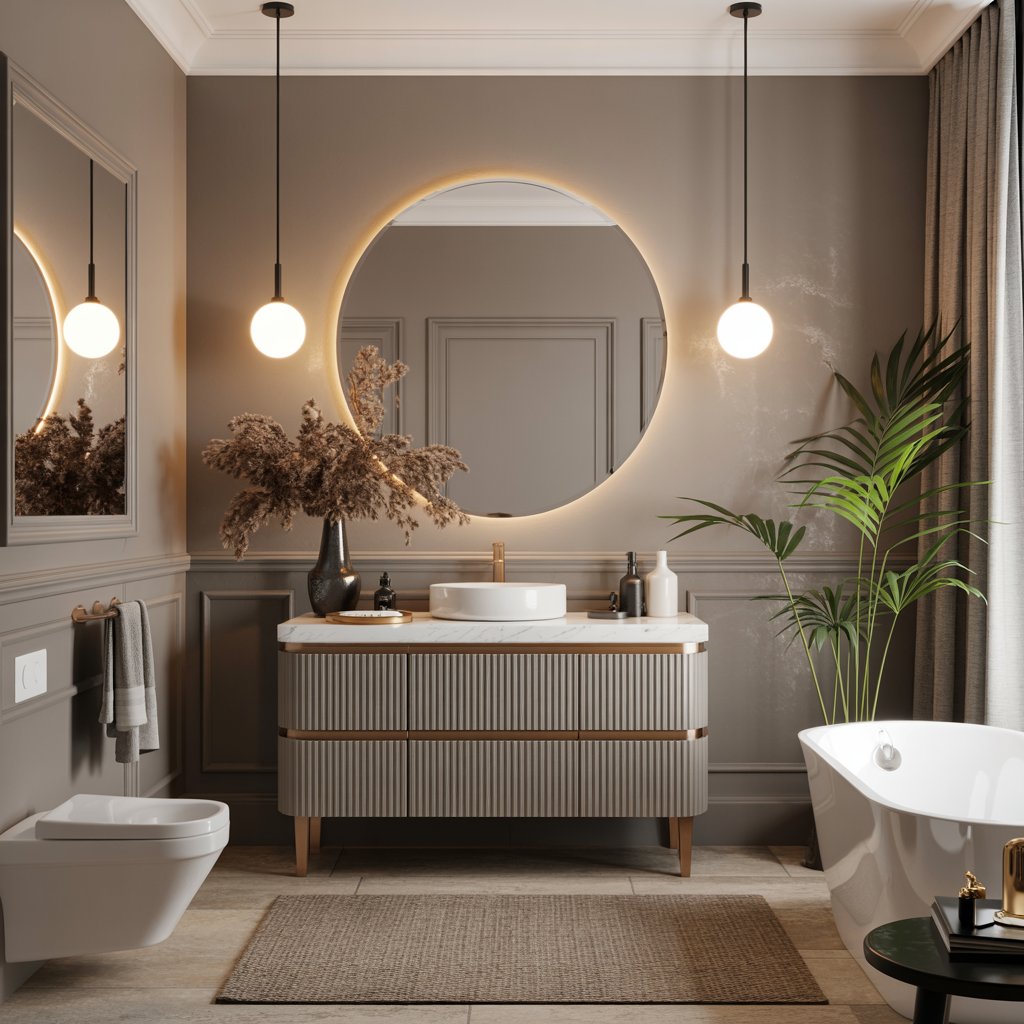
Can’t decide between grey and beige? Greige is your perfect neutral soulmate.
It’s warm, versatile, and provides a beautiful, calming backdrop. Lets your tiles, fixtures, and accessories shine without competing. The ultimate sophisticated canvas.
- Pro Move: This is the “safe” choice that never looks boring if you pick a shade with warmth. Easy to accessorize and change up seasonally. Total win.
13. Zesty Citrus Peel
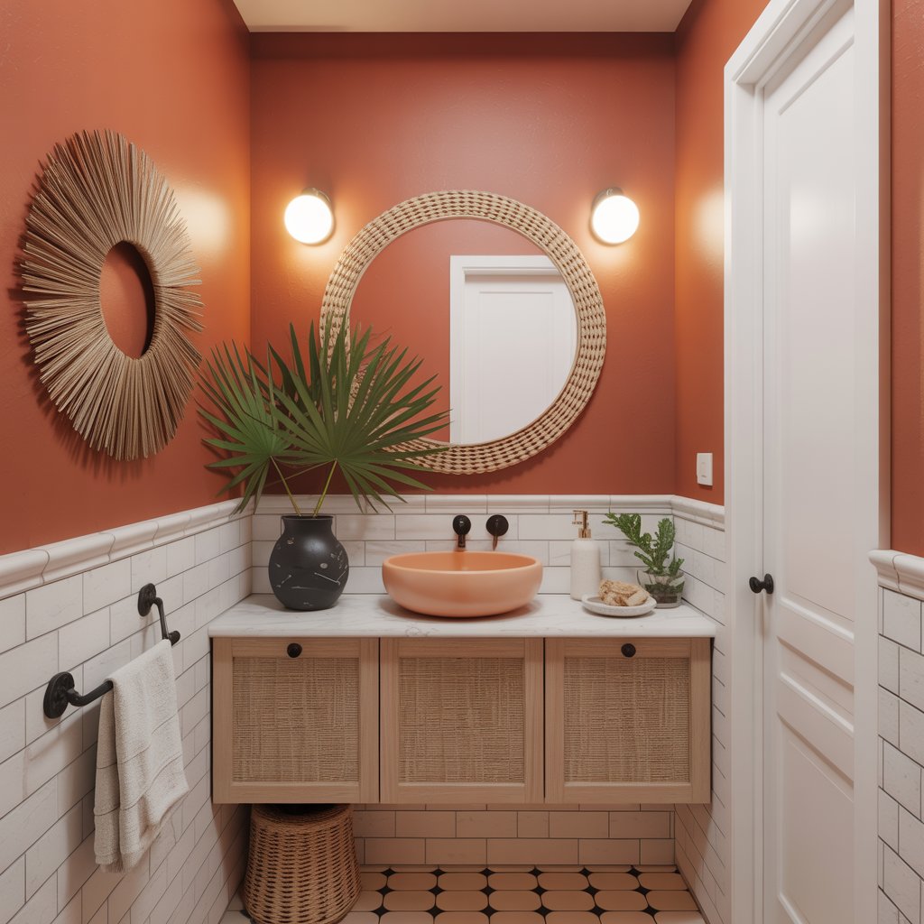
Feeling adventurous? A muted, earthy citrus (think soft terracotta-orange or muted tangerine) is unexpectedly warm and energizing. It’s like a shot of vitamin C for your walls! Use it sparingly – maybe just on the vanity or an accent wall.
- Personal Fave: I love this for a powder room! It’s a fun, unexpected pop that guests will remember. Just balance it with plenty of white and natural textures. Don’t go overboard!
14. Cool Misty Grey-Blue
Imagine the color of a calm, hazy morning by the lake. Misty grey-blue is soft, cool, and incredibly peaceful. It’s a step beyond standard grey, adding subtle depth and tranquility. Feels clean, fresh, and effortlessly chic.
- Pro Tip: This color looks stunning with chrome or nickel fixtures and crisp white linens. Add a touch of natural wood for warmth. Simple elegance at its best.
Wrap Up
From the grounded earth tones to the bold jewel shades, one of these colors has your name on it. Think about the feeling you want every single day: calm, energized, luxurious?
Your bathroom should be your sanctuary, not an afterthought. So, take the leap. Paint is the most transformative, forgiving tool in your home design kit.
I can’t wait for you to unlock that door and feel that “ahhh” moment you created all by yourself.